That Damn Goat
All work shown is not finalized. The game is a published title on Steam and Nintendo Switch.
.jpg)
Role
UI/UX Designer
Timeline
1 year 2 mos
(Spring 2022-23)
Skills and Tools
Visual Design, Product Research, User-Testing, Prototyping, Agile Development, Figma, Illustrator, Photoshop, Unity
As the only UI/UX Designer on the That Damn Goat team, I collaborated with the UI Developer and Lead Designers to understand our high-energy game and its player base to create an accessible menu system to match.
How might we...
strike a balance between function and mayhem?
The Opportunity
That Damn Goat is the definition of chaos with randomized characters and levels changing on a whim, and a rearing goat to stop you in your tracks!
With the game pushing forward in development, there became a growing need for a polished menu system and UI design that allows our players to easily navigate the attention-grabbing game at hand.
The Solution
Mimicking elements of the game's chaotic nature in the menu navigation and design was the key to providing our players with an introduction to the game’s mechanics while building a solid foundation for usability.
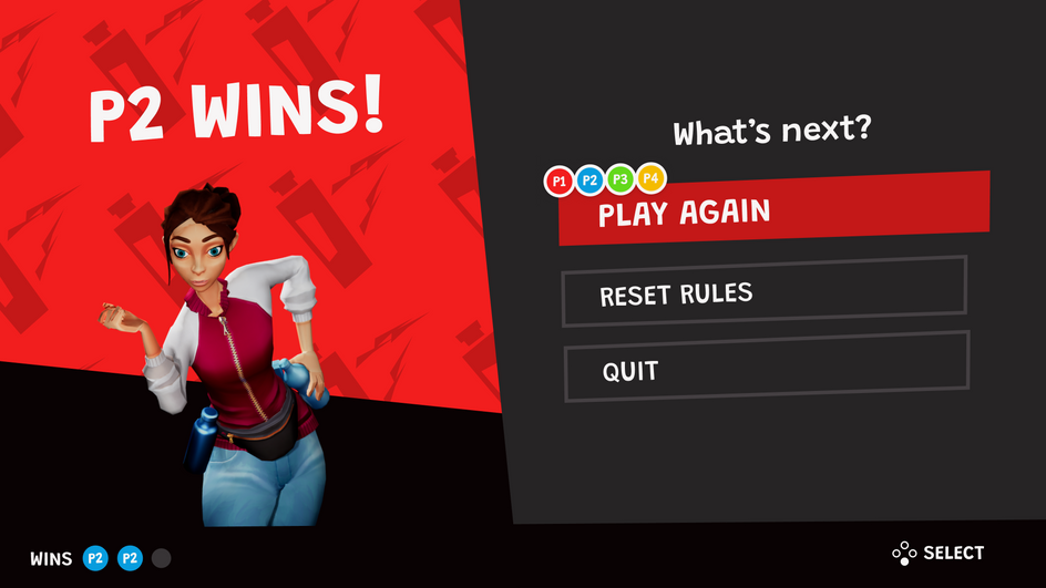
Finalized UI visual comps, not all screens are shown. Game assets are not final.
Menus With A Solid Framework
With carefully mapped interactions, That Damn Goat's current menu system incorporates multiple-player selections visually supported by a dynamic and quirky UI style.


Chaos From The Start
The simplified UI layout sets the stage for The Goat to be a prevalent presence in the startup menus and helps introduce the players to the true nature of their biggest foe.

Understanding The Product-Space
Starting where the previous UI/UX Designer left off, I focused my first few weeks on the team to compile a more comprehensive game UI database filled with diverse navigational patterns.
This aided the expansion of the current menu and HUD wireframe screens to include additional states and scenarios supporting multiple player inputs.


Games like Super Smash Bros.: Ultimate, Heave Ho, and Fall Guys: Ultimate Knockout were essential to understanding this kind of collaboration with multiple players, whether within gameplay or in their menus.
Establishing TDG's Interaction Framework
The most challenging part of designing the functionality of That Damn Goat's menu system was balancing inputs from multiple controllers and relaying the console's feedback to our players across the board.
A good example of this is how I handled the Player Ready-Up flow, ensuring a smooth set-up process for multiple players editing their player cards. I researched how controllers connect and disconnect to the Nintendo Switch console and visualized how that information can be communicated whether someone was playing with a single joycon, both joycons, a pro-controller, or with CPUs.
Controller connection flow and multiple screen-controller states on the Player-Ready Up screen.
Documenting Working Prototypes
At the end of the wireframe process, I created interactive prototypes and documentation of That Damn Goat's entire menu system. These materials served as a tool for visualizing every step our players would take, which was presented to the development team at the onset of implementation for their reference.

Wait, They Want More Goat!
Throughout the development process, the team and I conducted bi-weekly playtests in-house or through presenting at events like ROC GameFest, PAX East, and GDC (Game Developers Conference).
What stood out to all of us within the overwhelmingly positive reception towards our resident master of chaos were the many requests for even more of
his presence, and I took note.


