The Challenge
The main difficulty in transitioning a physical form of identification into a digital space is retaining its authenticity and function. Doubled with streamlining the use of this physical object for Millenial and Gen Z audiences, the concept of the digital ID needed to evolve.
The Solution
Acting as an interface, NYS ID trends away from direct representation of physical identification following a defined brand, layout, and interaction model to achieve personalized and organized digital information delivery.

Full Identification
All of the information found on the front and back of a physical driver’s license is readily available to law enforcement and other legal authorities.
Age Only
Name, birth date, and age are displayed for verification when purchasing alcohol or in additional situations where age needs to be confirmed.


Essence of the Big Apple
The vibrant art-deco-inspired personality of NYS ID cements the digital identity of New York State.
With the application of playful color and shape-based patterns, NYS ID's UI takes on a modern feel while establishing a natural information hierarchy.
Inclusive Identification
The format of NYS ID is adaptable to any driver's license type and is accessible with various forms of ID photos in regards to contrast and skin tone.


Trends and Conusmer-base Findings
Living In The Digital World
With 307 million Americans owning smartphones, digital products have become an integral staple of navigating everyday life.
For The Younger Generation
Millenials and Gen Zs make up 42.5% of the U.S. population with newer digital products being marketed and tailored specifically for their usage.
9 Out of The
50 States
As of 2021, Arizona, Colorado, Georgia, Hawaii, Louisiana, Maryland, Mississippi, Ohio and Utah have gone digital with their driver's license.
With this information, I saw the potential for NYS ID to be more of a digital product. This would allow it to easily expand and adapt to other forms of legal identification in the future.


What Digital ID Apps Are Already Out There?
Looking into products like MobileID, myColorado, and LA Wallet helped me understand how the framework of a physical ID can be translated into a centralized interface.
Addressing Painpoints
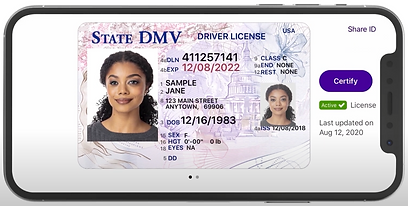
I found that these products copied the design of the physical ID quite literally while separating, and in some cases hiding, features across multiple screens.


Sketching Possibilites
At the onset of designing NYS ID, I aimed to create a streamlined user flow by incorporating fixed navigation and opted to use a card-based UI to maintain familiarity with the form of a driver’s license.
Exploring User Flows and Functionality
It was difficult to gauge which interaction model would be the most efficient in communicating and navigating the provided license information, so I explored the following wireframe options to create the most simplified and compact experience possible.
Developing the NYS ID Brand
I started out with two design directions, the first having an organically textured and calm atmosphere and the second focusing on bold forms with punches of color.
Direction 1

Direction 2

An Alternative Visual Route
Hitting a roadblock with the cohesion of NYS ID's branding elements, I pivoted to incorporate more rhythm in an art-deco style and utilized imagery more characteristic of New York City.
This rework helped me emulate the energy I felt was missing in the branding of my designs.
.png)
Version 1

Version 2

Iterations on Iterations
Across four rounds of iterations, I streamlined the functionality of the NYS ID interface and adapted its visual direction to fit the liveliness of New York City.
Using known visual elements like the Statue of Liberty torch helped foster a stronger connection to the state.

Version 3

Version 4
In-App Experience
Utilizing Figma's components and auto-layout within my design, I was able to prototype what the NYS ID in-app experience would look like. This prototype follows the user as they navigate the full identification, age identification, and QR scan screens.
Application in Apple Wallet
Testing the scalability of NYS ID's design led to envisioning how the interface would function within Apple Wallet.
Takeaways
Having a strong UI layout wasn't initially enough to sell the idea of a New York State digital ID. Iterating on several ideas that didn't hit the mark showed me the importance of fleshing out branding and usability research.
These steps are integral and should be revisited throughout the design process to create a fully comprehensive design.
Next Steps
-
Expanding user testing to consumers to get a more accurate temperature check on usability.
-
Exploring more movement-based interaction, like tilting a digital device, and its impact on the overall viewing experience.
-
Developing a comprehensive brand system to accommodate the future expansion of NYS ID.


